1) Discovery & Deep Dive
Before any design choices, we talk. We begin with a comprehensive audit of your current market position using the Brand Positioning Workbook. We strip away the noise to uncover your unique competitive advantages and identify the specific „Brand Feeling“ and USP that will resonate with your audience.
Outcome: Total alignment on the brand’s strategic intent. You receive a workbook which then will define the direction.
↓
2) Strategy & The „North Star“
In this phase, we build your Brand Workbook. We synthesize our findings into a definitive „North Star“—a strategic roadmap covering Brand Positioning, Narrative, and Tone-of-Voice. This document ensures every visual decision made hereafter is a calculated move toward commanding a premium market share.
Outcome: A documented brand DNA that serves as your business bible.
3) Shaping the Visual Concept
Now the FUN part! Exploring, shaping, and defining the brand identity.
From clarifying a brand to designing how it appears across channels, everything is built as one connected brand world. Design systems, social frameworks, and art direction support growth while preserving character.
Outcome: A sophisticated visual world designed for consistency and authority.
↓
4) Delivery & Brand Activation
The final phase is the transition from concept to market. I provide a Brand Activation Roadmap to ensure your launch is seamless and impactful. We decide what touchpoints your brand needs to more forward and, you receive a full suite of organized, high-resolution assets ready to engage your audience.
Outcome: A confident, high-impact entry into your next chapter of growth.

Strategic Rebranding
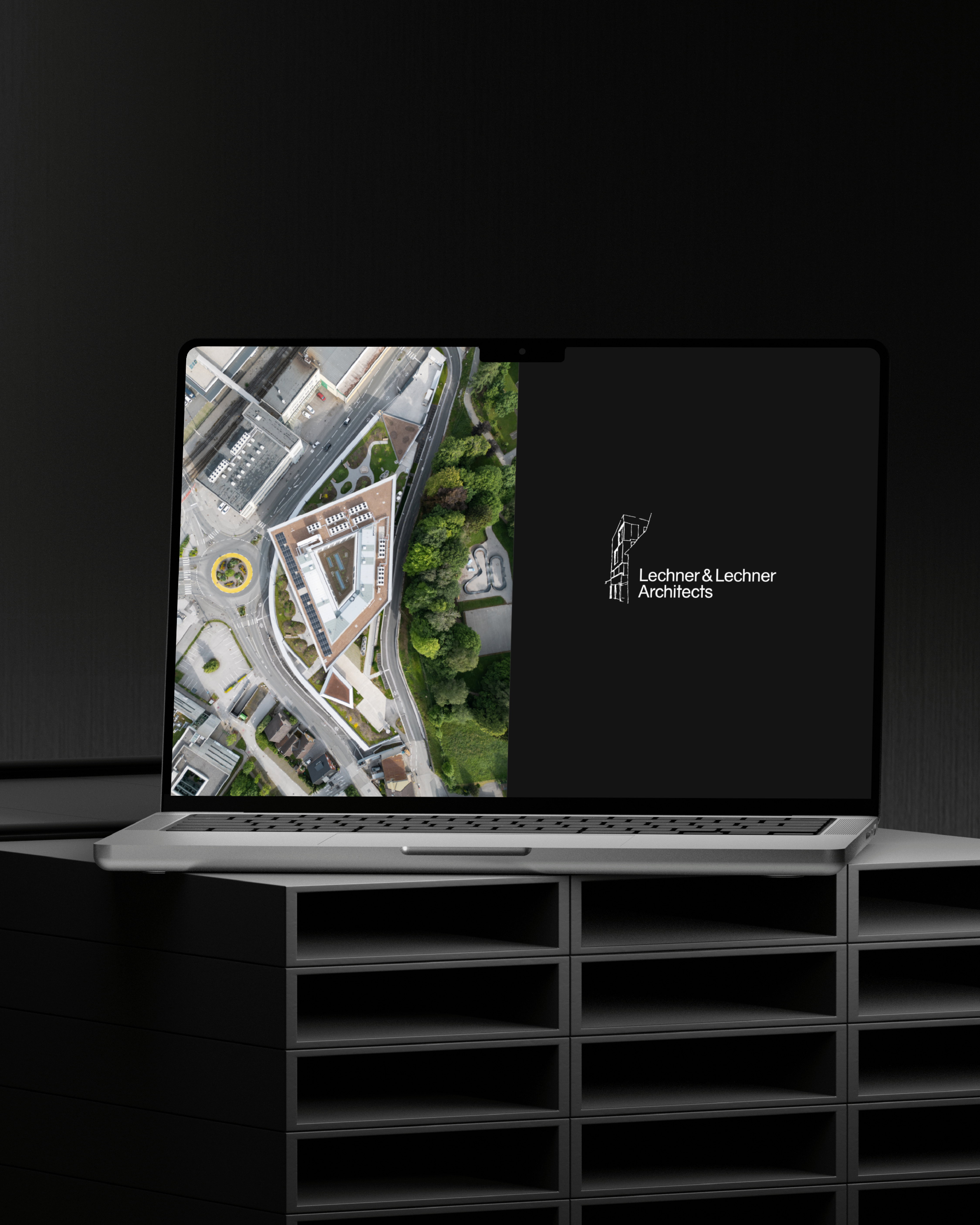
Lechner & Lechner Architects Salzburg
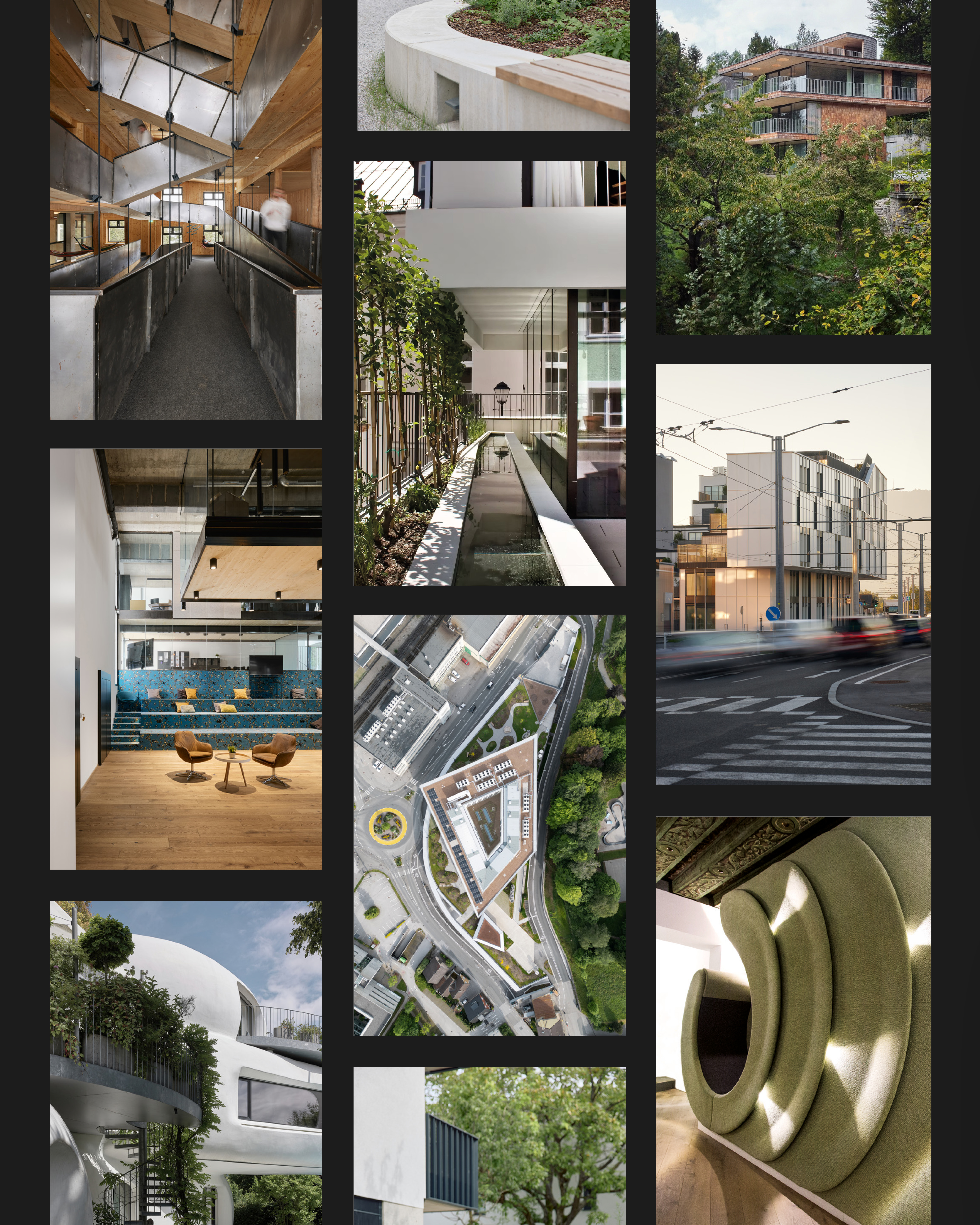
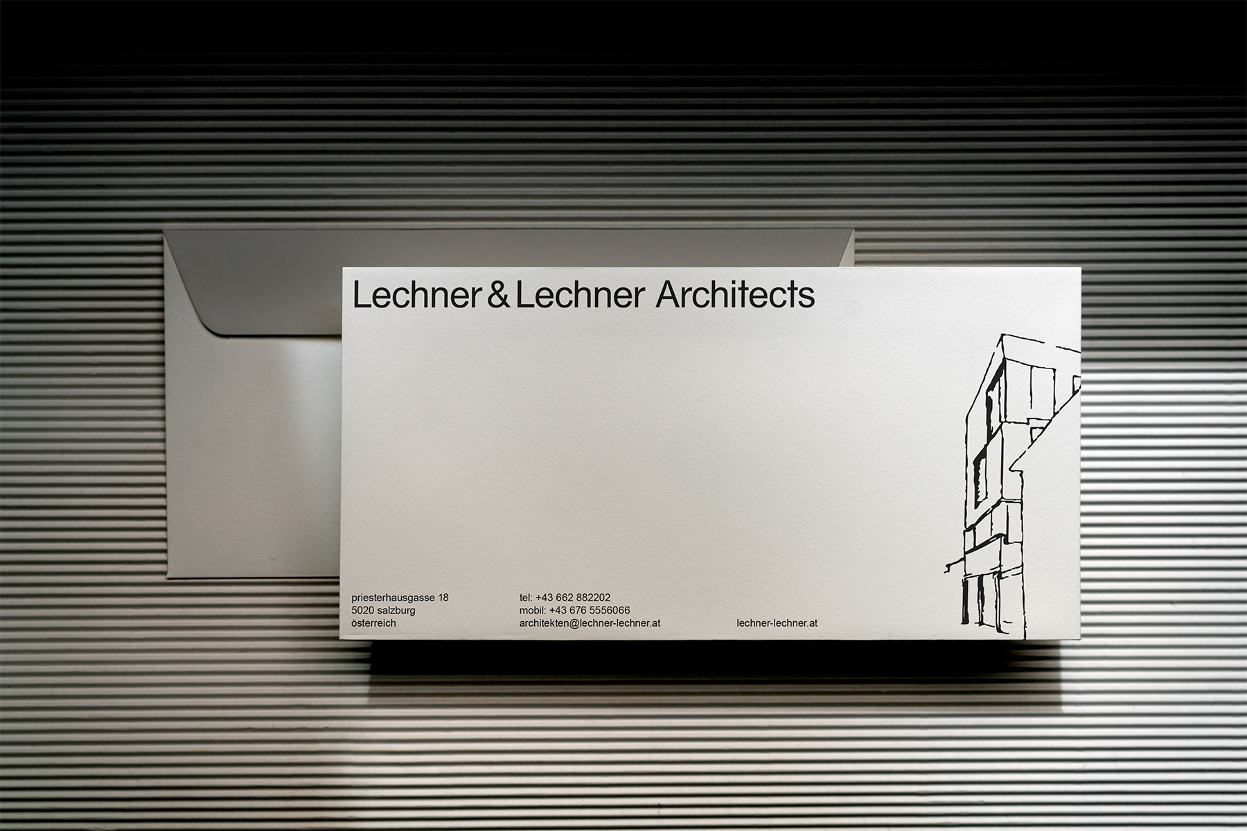
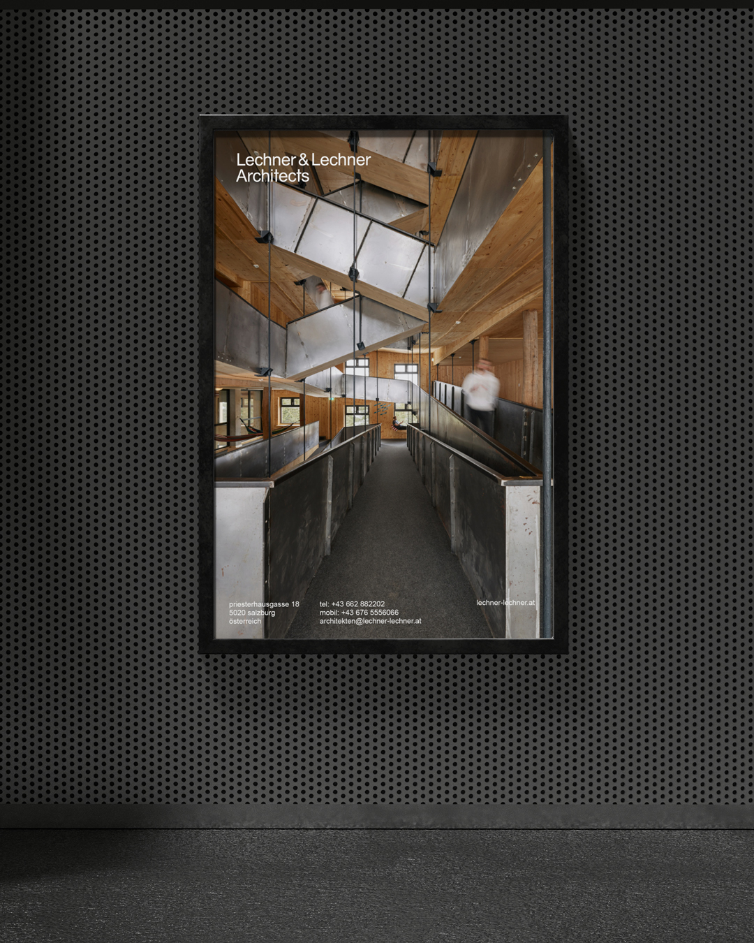
With nearly 40 years of architectural practice behind it, Lechner & Lechner Architects in Salzburg brought a rare depth to the rebranding process: an established reputation, a distinctive architectural attitude and a substantial body of work. The new identity was shaped to honour that foundation while giving the studio a clearer, more contemporary visual presence for its next chapter.
Utilizing the Brand World framework, we uncovered a narrative of unembellished rationality and precision. We anchored the identity in architectural logic to reframe their expertise through a lens of restraint.
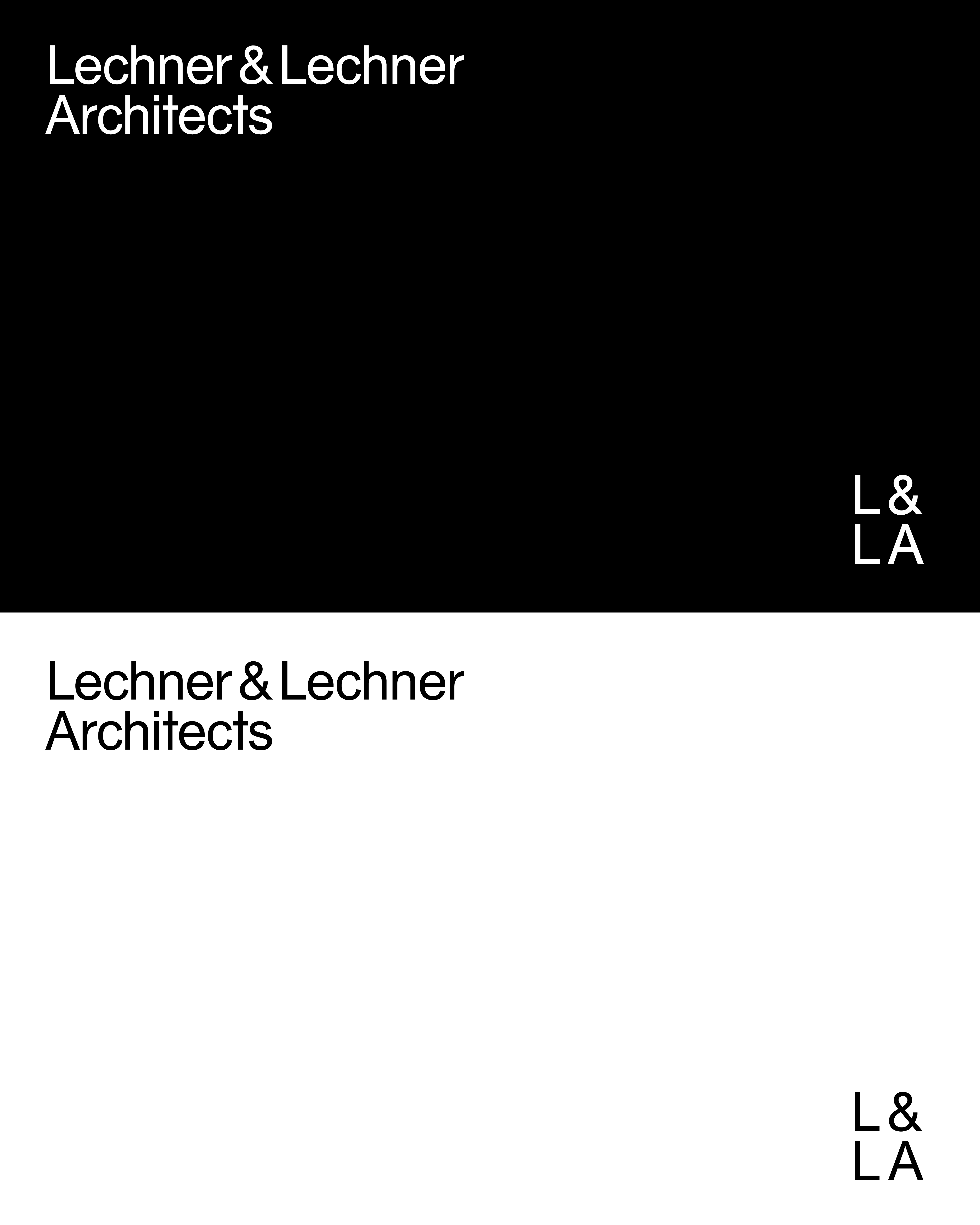
The visual direction was clear from the beginning: black and white, one typeface, no unnecessary decoration. The identity had to feel precise, architectural and quietly confident.
After many iterations with different typefaces, layouts and typographic structures, the system arrived at Arial. A typeface everyone knows, almost everyone has, and many would overlook. That became the point: to challenge the ordinary and create distinction from something radically familiar.
Used with discipline, scale and structure, Arial became the backbone of a restrained visual identity — supported by a refreshed logo, a black-and-white language and a modular system for technical documentation and public-facing communication.
The new brand system brings the studio’s architectural attitude into sharper focus. It creates consistency across technical documents, project presentations, competitions, publications and international communication. The impact is a visual presence that feels precise, recognisable and aligned with the standard of the work itself.
Core Services @atelier29a
Brand Strategy
A clear foundation for where your brand is going, what it stands for and how it should be understood.
Questionnaire
Discovery
Business context
Audience insight
Positioning
Naming
Verbal identity
Brand story
Creative direction
Visual System
A distinctive visual language that gives your brand form, rhythm and recognition across every touchpoint.
Questionnaire-based direction
1–3 creative routes
Mood board
Logo exploration
Logo refinement
Type pairing
Colour palette
Graphic elements
Image direction
Applications
Web Design
Clear, structured web design for landing pages, online shops and full websites — built around intuitive visitor paths, SEO-ready content and a digital presence that makes the offer easy to understand.
Platform setup
Sitemap
Page structure
Wireframe
Content flow
Visitor & Conversion path
Copywriting
Mobile structure
SEO setup
Launch support
After-launch care
Once the foundation is in place, we can extend your brand across the materials your business actually needs: business cards, stationery, brochures, flyers, menus, posters, signage, wayfinding, packaging, labels, presentations, pitch & sponsor decks, social media templates, campaign assets, digital ads, newsletters, event graphics, exhibition materials, editorial design, guides, maps, tourism publications such as annual reports, magazines and visitor guides, and everything in between.
The Collaborative Approach
Whenever a complex project calls for extra hands, it expands seamlessly into a powerhouse through a trusted collective of masters of their craft.
Our Creative Circle Includes:
Web Developers — Illustrators — Motion Designers — Content Creators & Social Media Specialists — Photographers & Film Makers.
Selected projects
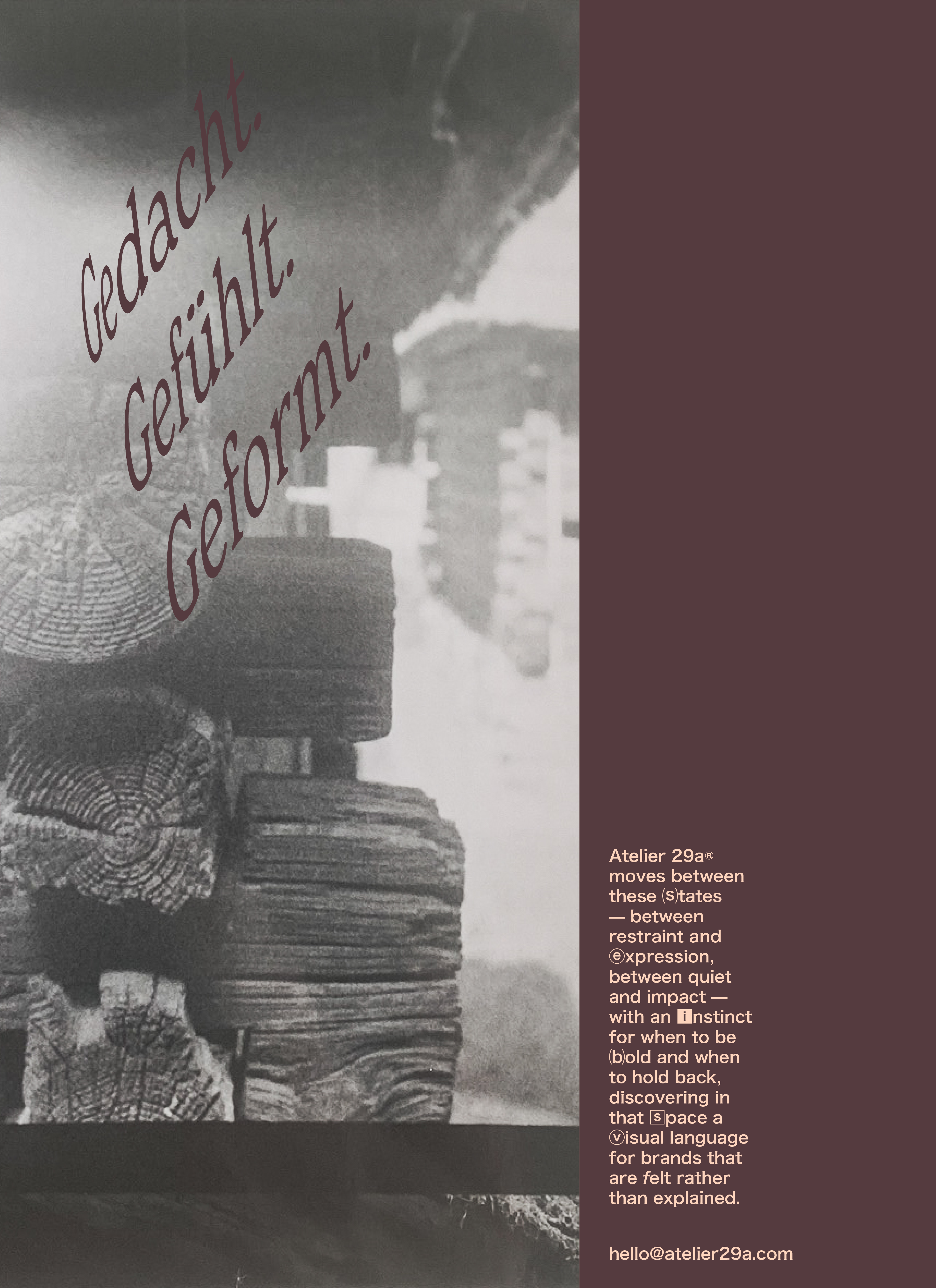
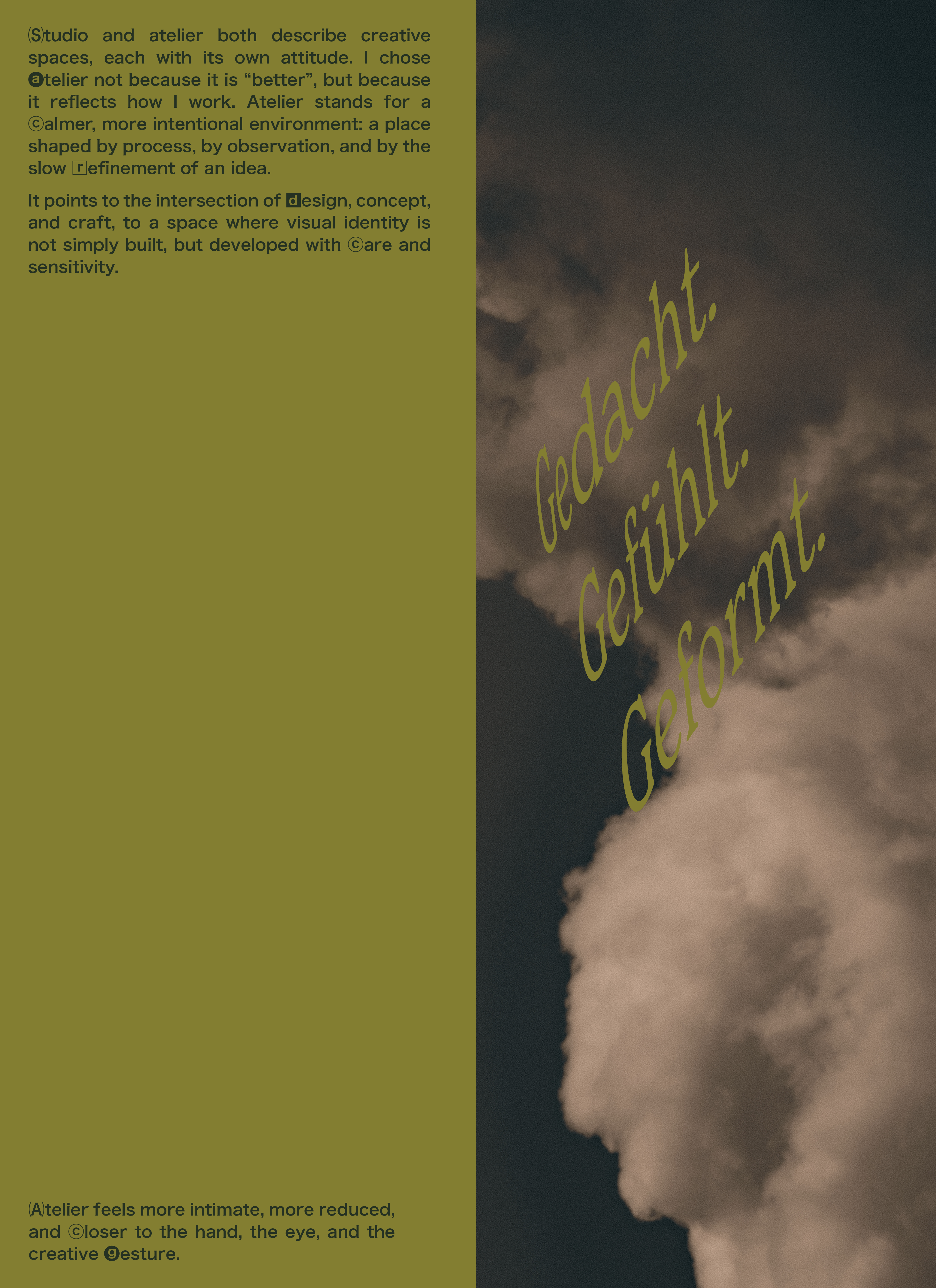
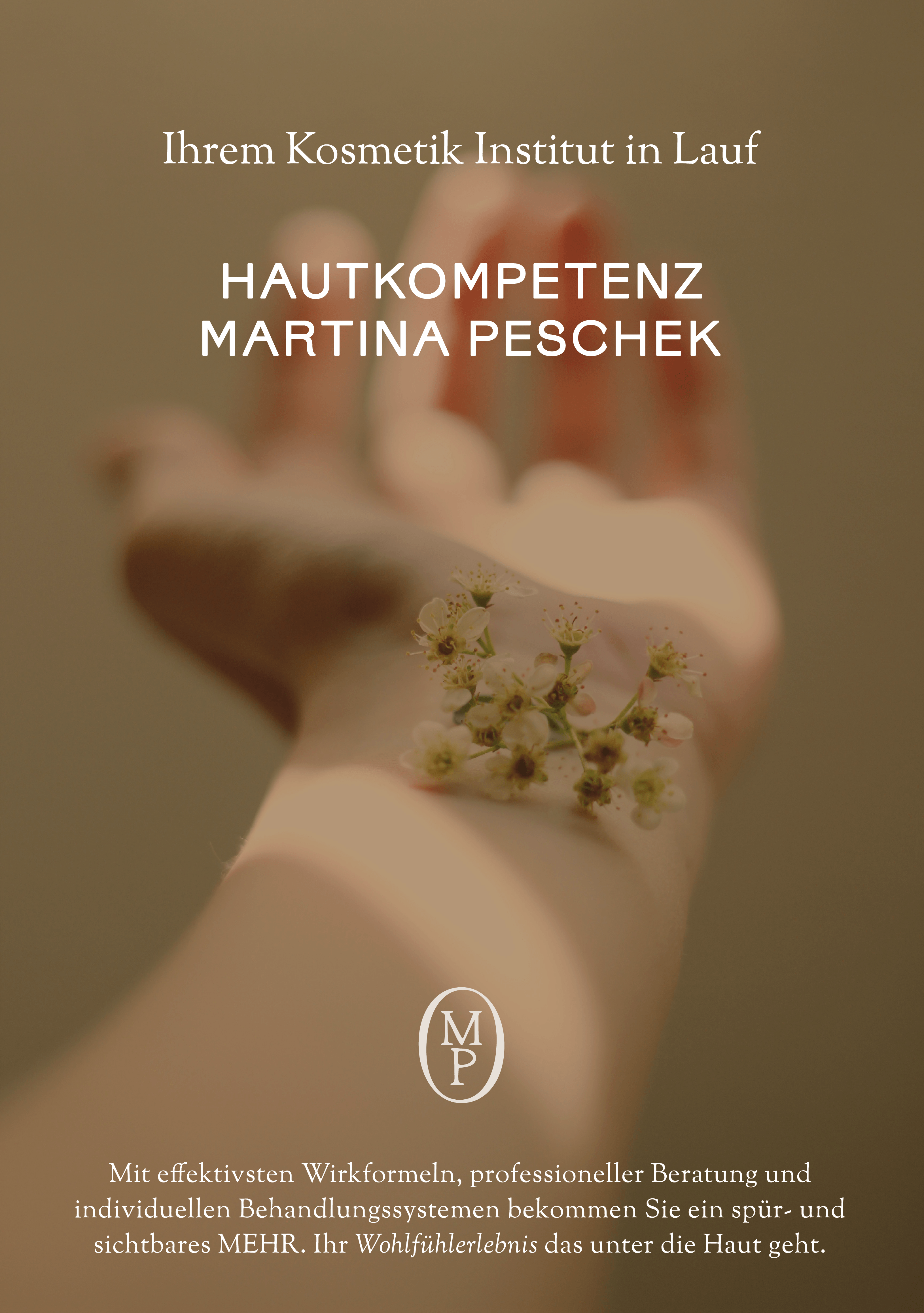
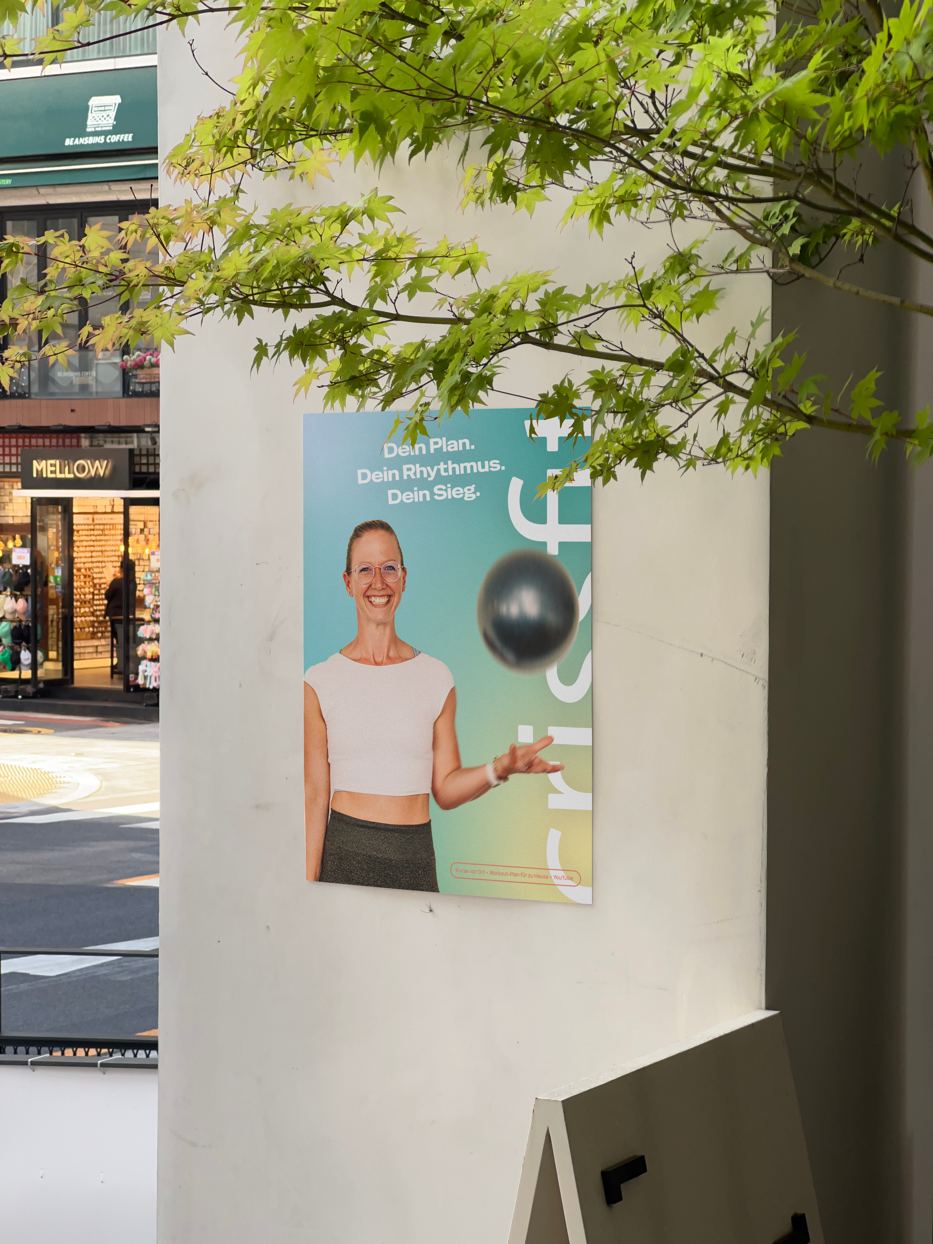
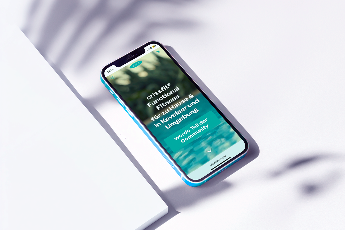
An experimental visual series exploring the relationship between thought, emotion, and expression through typography and image-making.
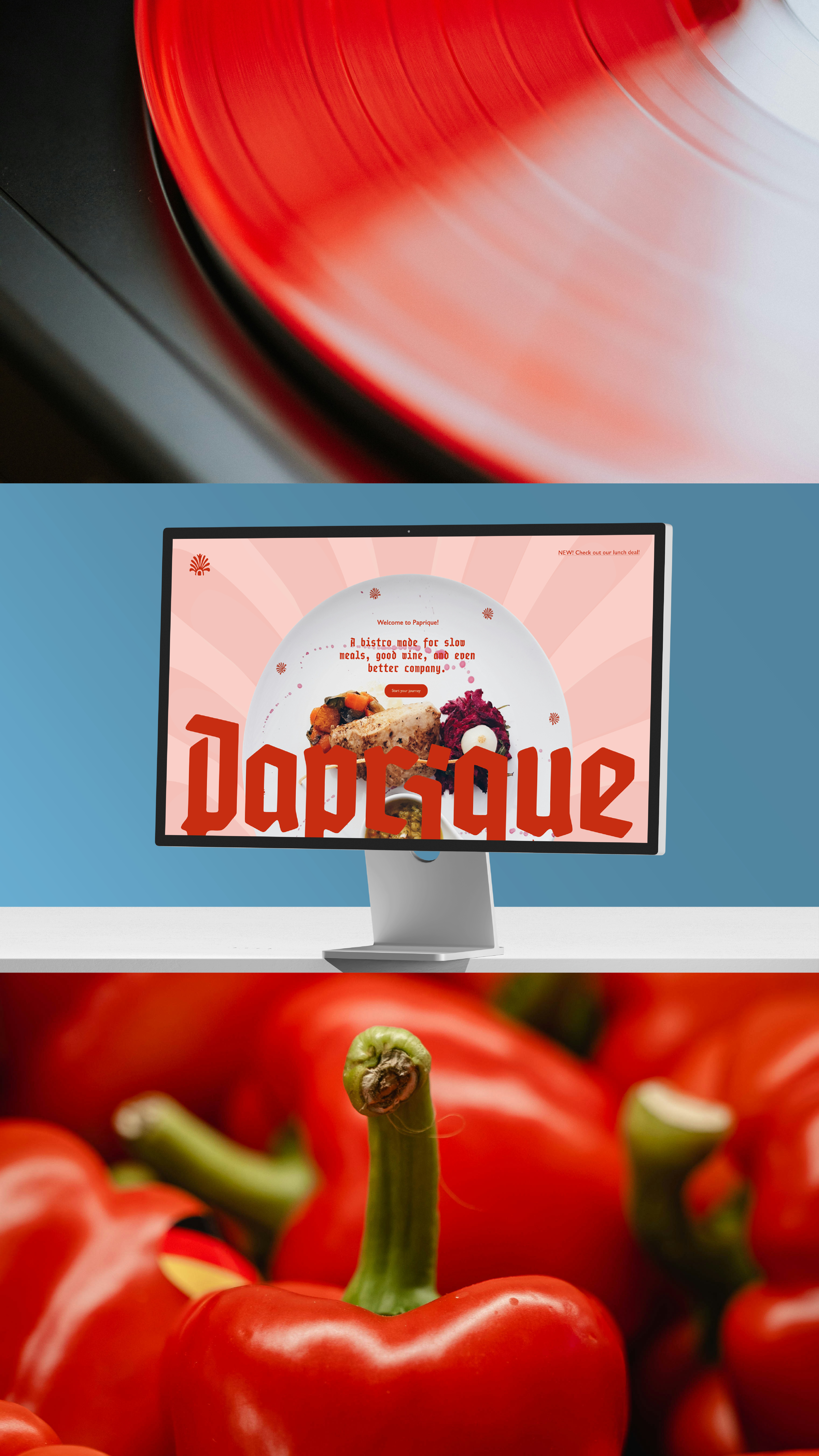
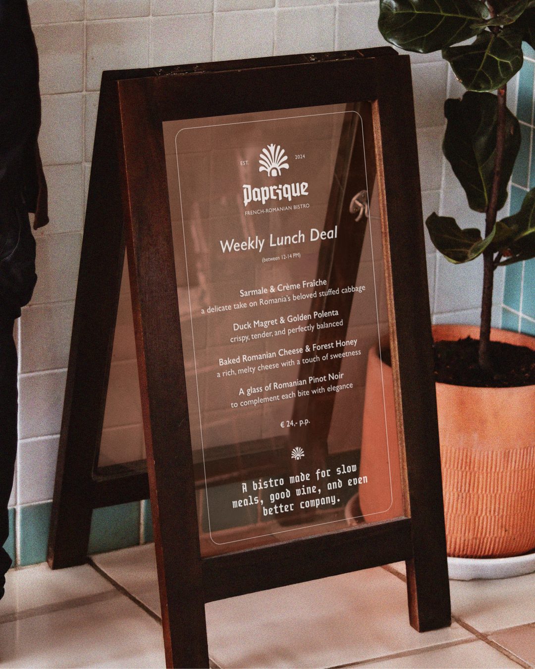
A bold and immersive website concept bringing the spirit of Paprique to life through expressive typography, rich imagery, and playful storytelling.
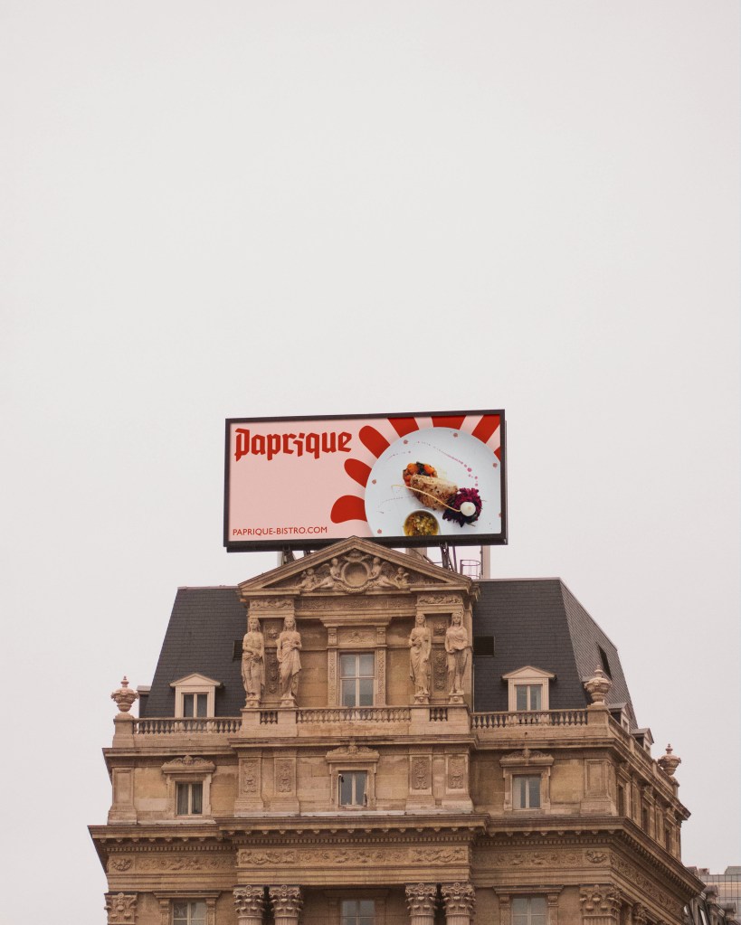
A vibrant outdoor campaign designed to stop people in their tracks and bring the energy of Paprique into the public realm.

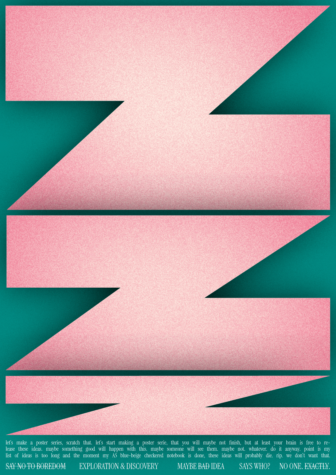
An experimental poster series exploring typography, composition, and visual expression. Created as a playful response to routine and predictability, the project celebrates curiosity, spontaneity, and the joy of making.



About
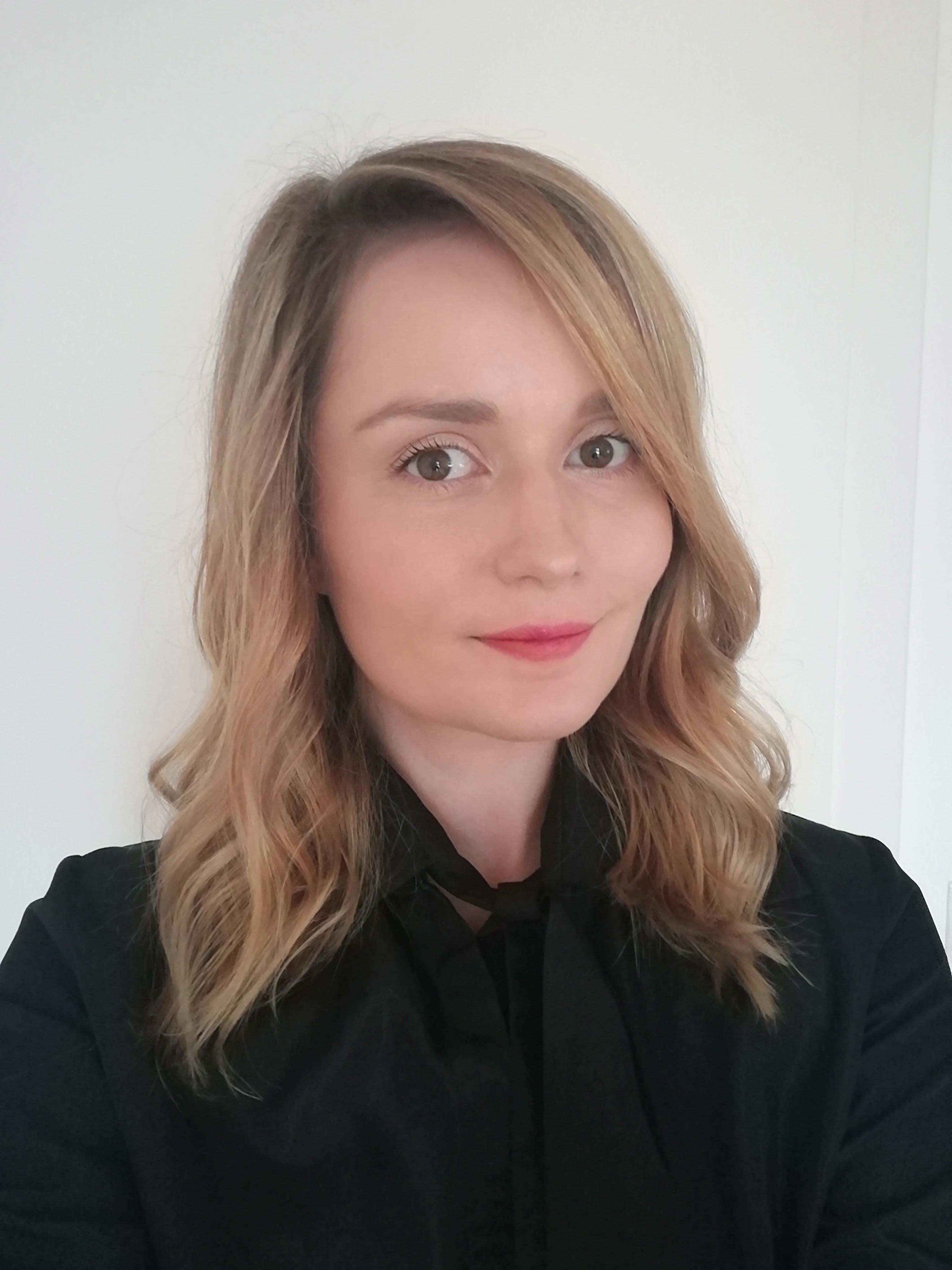
With over seven years of hands-on experience in graphic and communication design, the Atelier’s expertise spans the full spectrum of visual communication—from the technical precision of print production and digital interfaces (Web) to the strategic storytelling of ad campaigns and social narratives.
Whether crafting a brand identity or directing a multi-channel campaign, the work is always informed by a spatial understanding of design. This foundation allows the Atelier to move seamlessly between digital screens and physical environments. The goal remains the same: to ensure that whether a brand is experienced on a mobile device or within a physical city landscape, its ‘aura’ remains consistent, intentional, and calm.
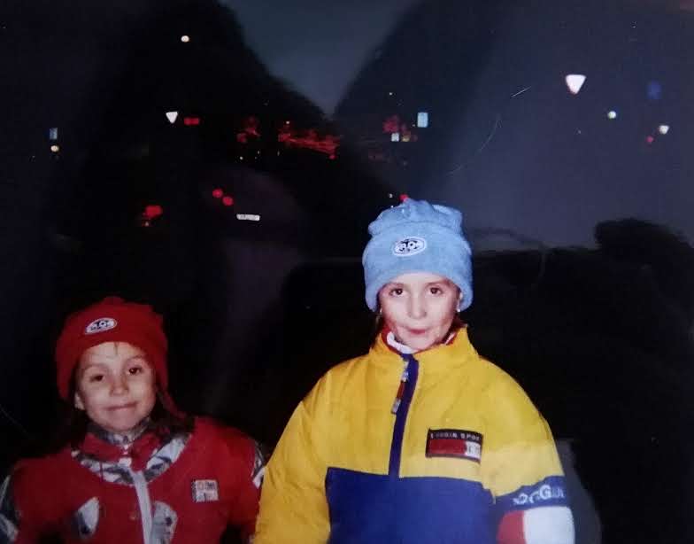
Bucharest NYE 1998
Long before I became a designer, I was drawn to structure, aesthetics and the way thoughtful details shape how we experience the world. Today, that curiosity translates into strategic brand, web and communication design for businesses and projects that value clarity and character.
I know what it feels like to carry a vision and want to bring it into the world the right way. That’s why I work with businesses and founders who value thoughtful decisions, strong design and long-term thinking. The aim is simple: to create brands people don’t just see, but remember.
That’s why…
Cinematic Minimalism:
How we* think
In an era of digital noise, true luxury is found in the pause. Atelier 29a® uses an editorial approach guided by intentional white space and slow-motion visual narratives to command attention without shouting. The Atelier brings a calm, systematic approach to the often-chaotic process of brand development.
By focusing on “stillness” as a status symbol, we position your brand as a sophisticated destination for those who value depth over distractions.